Welcome to PAR’s PixelPoint Reporting Catalog.
This catalog currently focuses on PixelPoint ReportViewer reporting which is included with every PixelPoint POS system. We are working hard on publishing all PixelPoint WebView reports for the PixelPoint HeadOffice enterprise software.
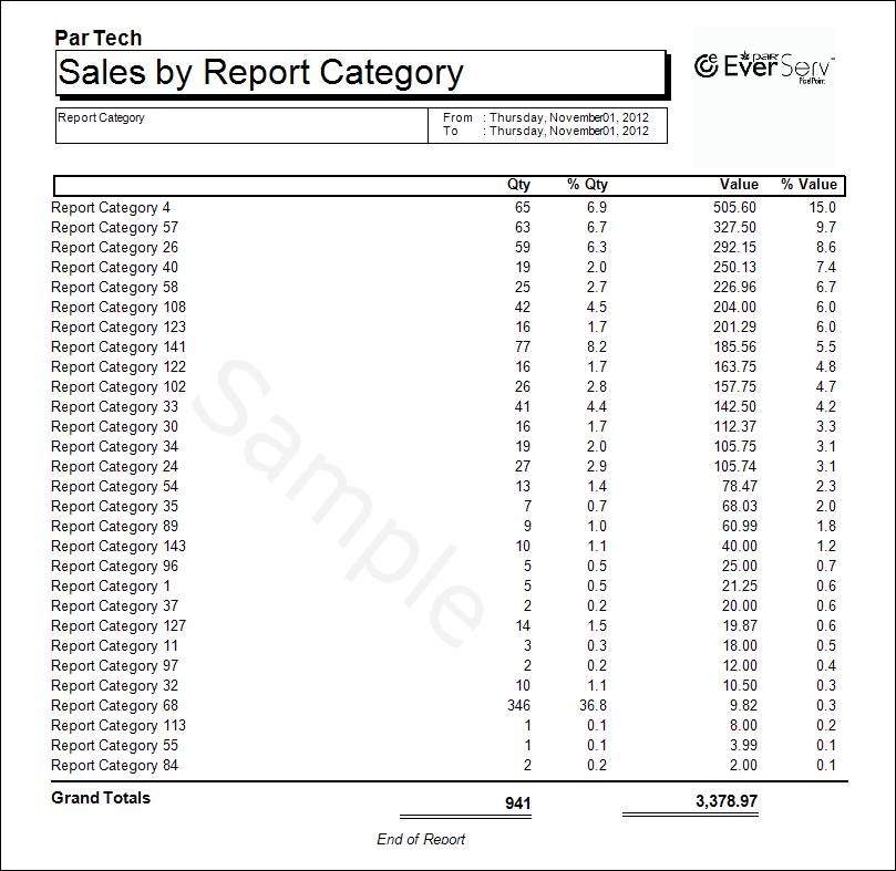
This catalogue provides an explanation about and sample views for each of the 300+ ReportViewer reports available with PAR’s PixelPoint POS solution. Click on each report page sample to see a larger view.